Revamped
Navigation Menu
In-depth research and design enhancements for better bank user navigation
Brief Introduction
To support the platform’s growth, the bank faced issues with an overcrowded navigation bar and poor wayfinding, prompting the need for a redesign
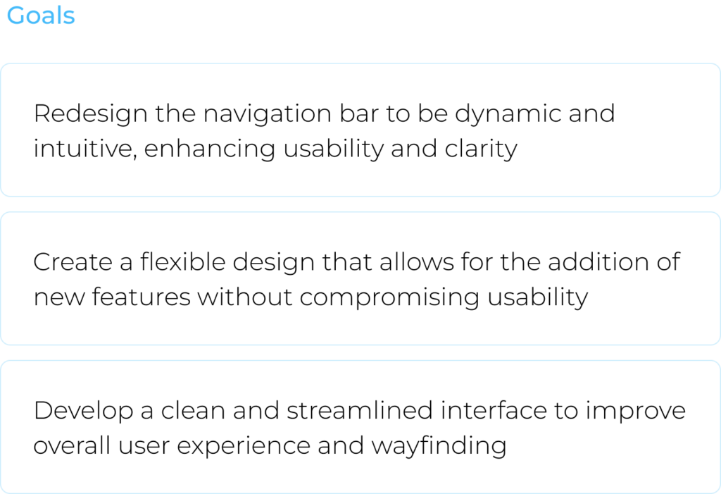
Focus
The research and redesign focused on decluttering the navigation bar and improving both its clarity and scalability
Team
Design Team:
Me (Lead Designer) + Design TL (Mentor)
Who I worked with:
Project Manager TL + Team
Tools
Figma


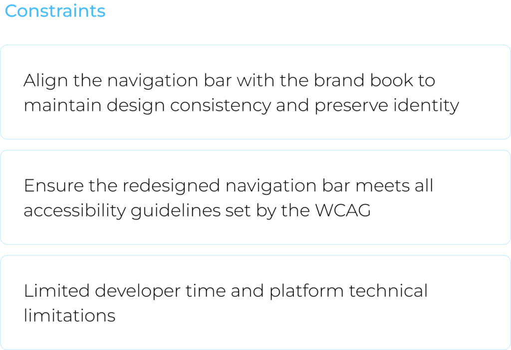
Challenge
Transforming the overloaded navigation bar into a dynamic, intuitive, and streamlined design that supports section expansion and accessibility, in compliance with WCAG standards

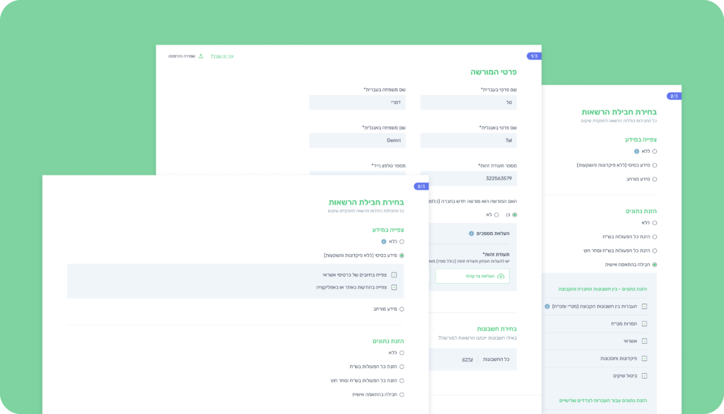
Informed by Research
To meet our objectives, we conducted Market and Design Research to understand the ecosystem, trends, and customer needs
A glimpse from the Market & Design Research
By analyzing direct and indirect competitors, we identified the most effective navigation bar solution focusing on hierarchy, visual overload, dynamic capability, and more
A glimpse from the Design Process
Explored key aspects such as hover effects, interaction, and icons, among others, to guide our design process effectively
Key Insights
Based on the market and design research on complex systems, we identified 3 core insights
1. Anchor and Mapping
Ensuring users always know their location and available options is essential for an excellent user experience
3. Dynamic and Scalable
A navigation bar must be scalable and intuitive to handle numerous features or categories efficiently
2. Hierarchy is Key
In a crowded navigation bar, segmenting items into groups and presenting them clearly is crucial for effective organization

User-Centric Design
The solution focused on user needs, integrating research and insights to deliver an intuitive interface
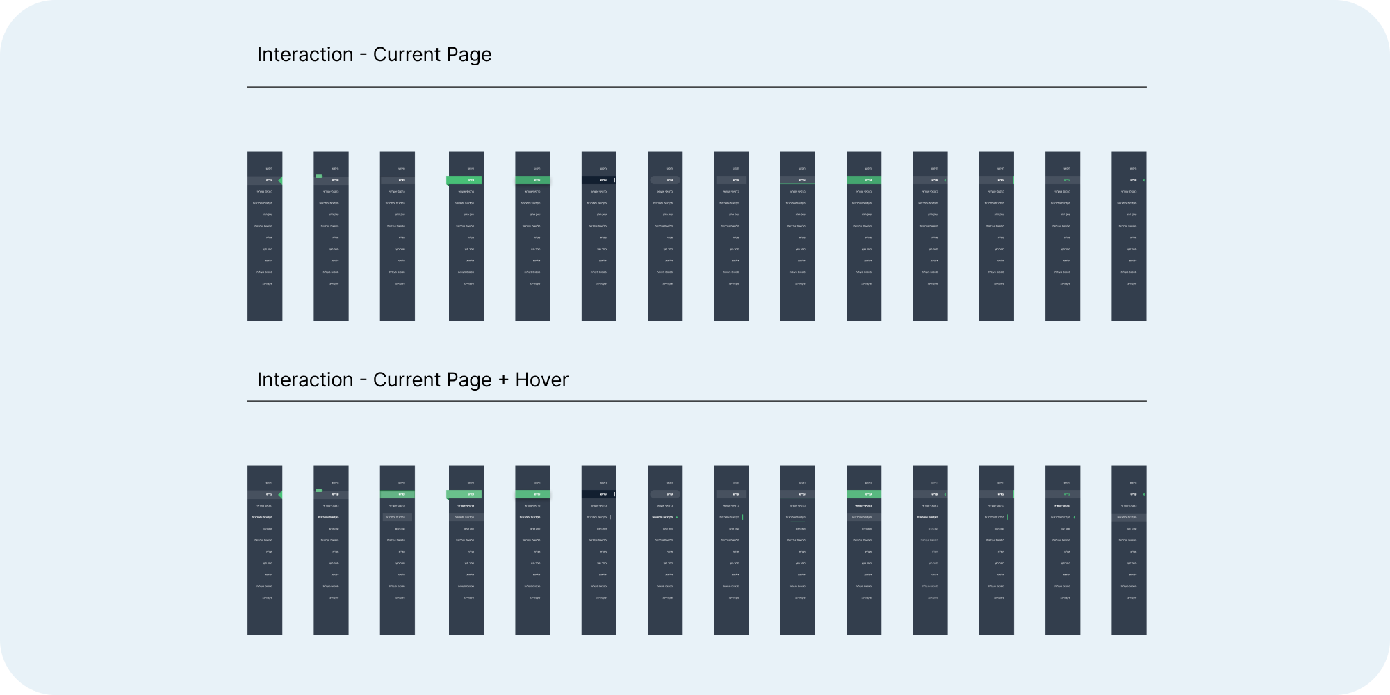
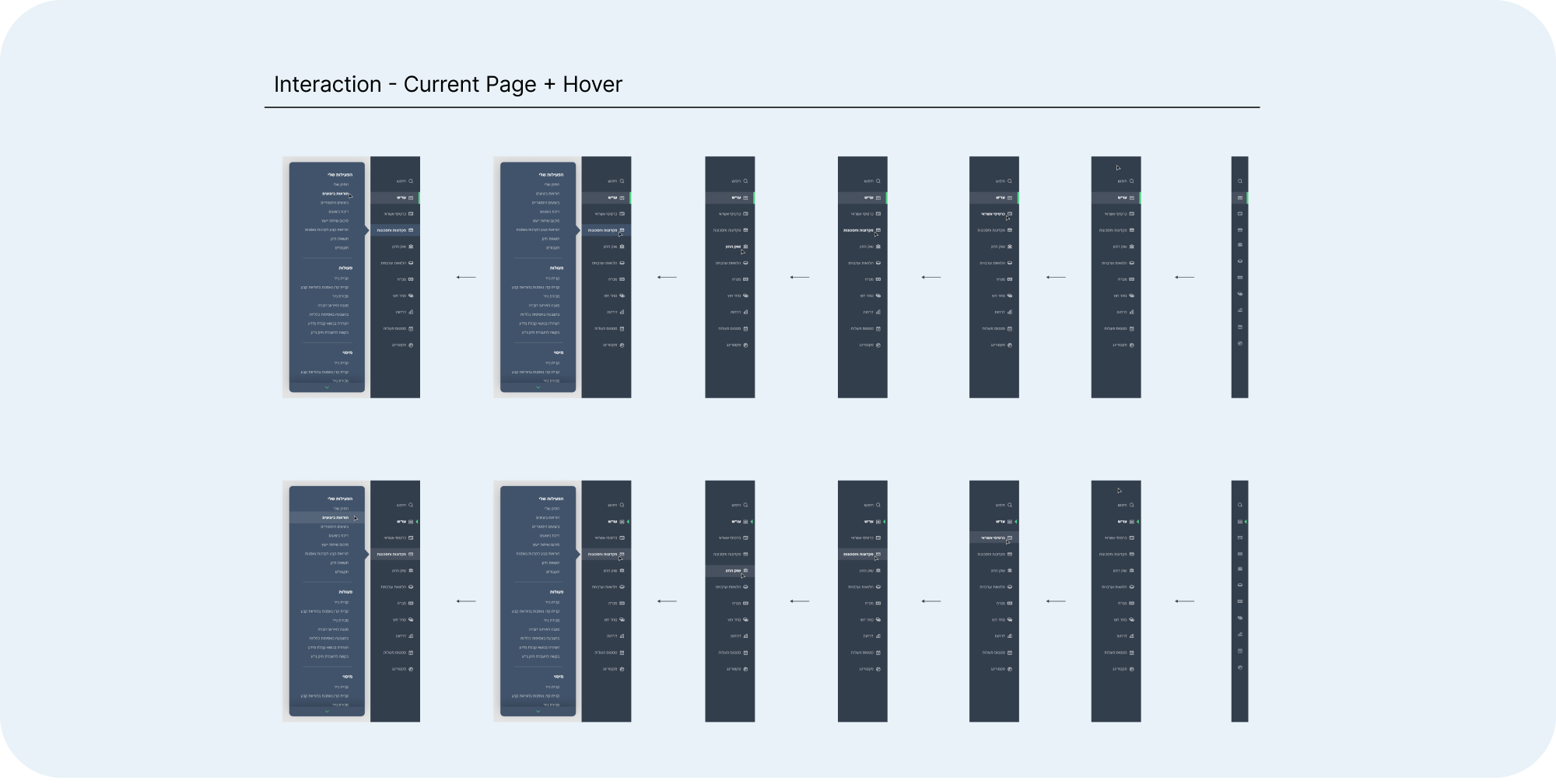
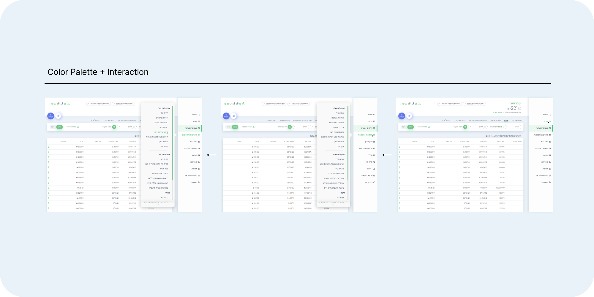
Anchor and Mappin

Visualization of current and navigated page
using Micro-interactions for a more intuitive design
Icon-based communication
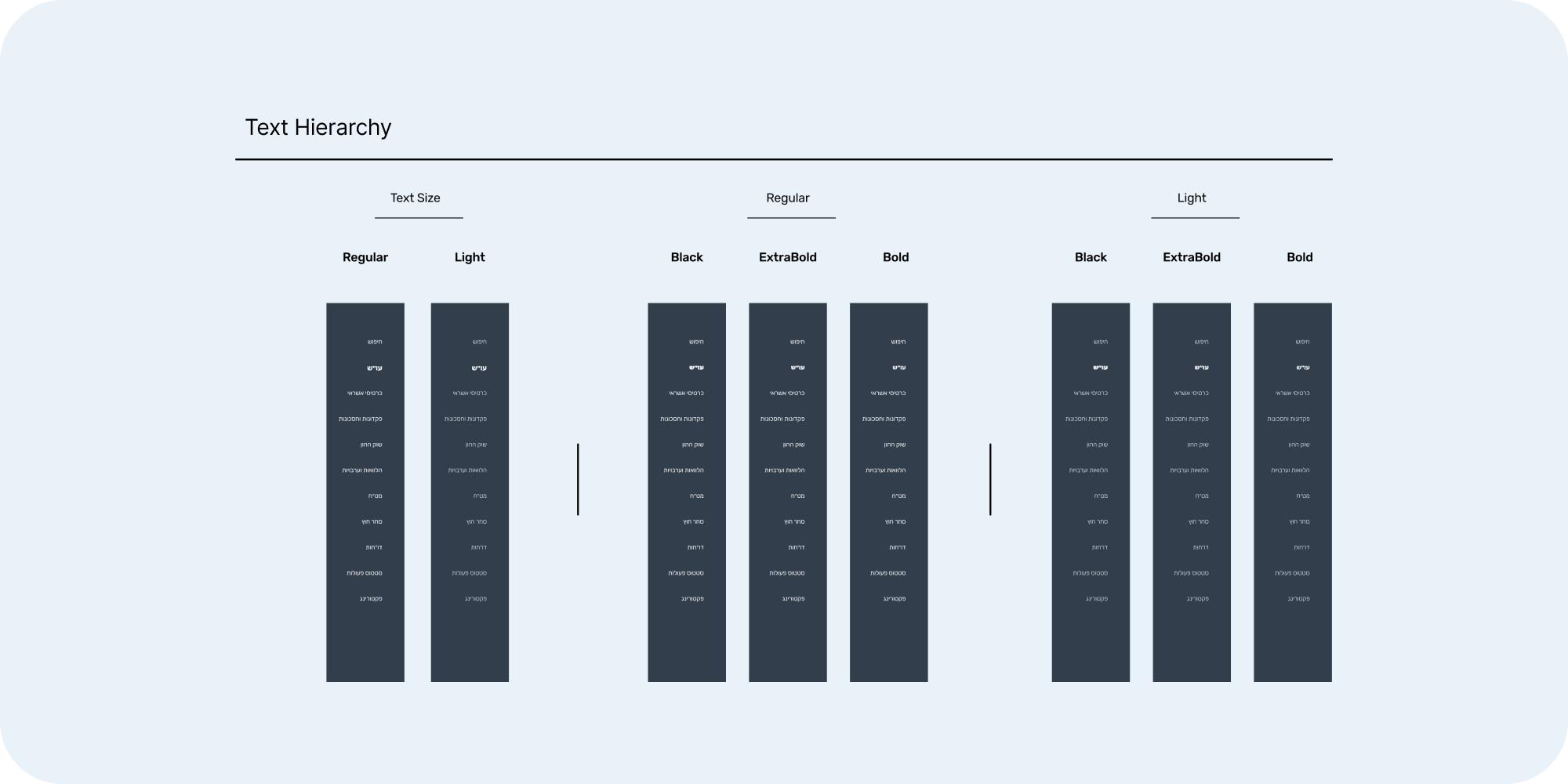
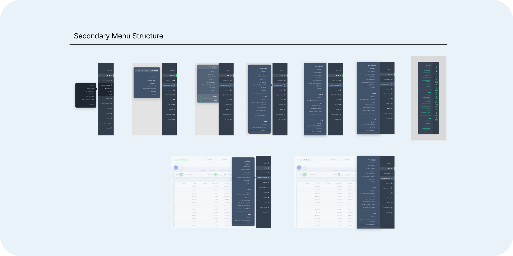
Hierarchy is Key

Category Collapse and Expansion

Segmenting and Framing Categories
Highlighting a Unique Category to Indicate Active Status
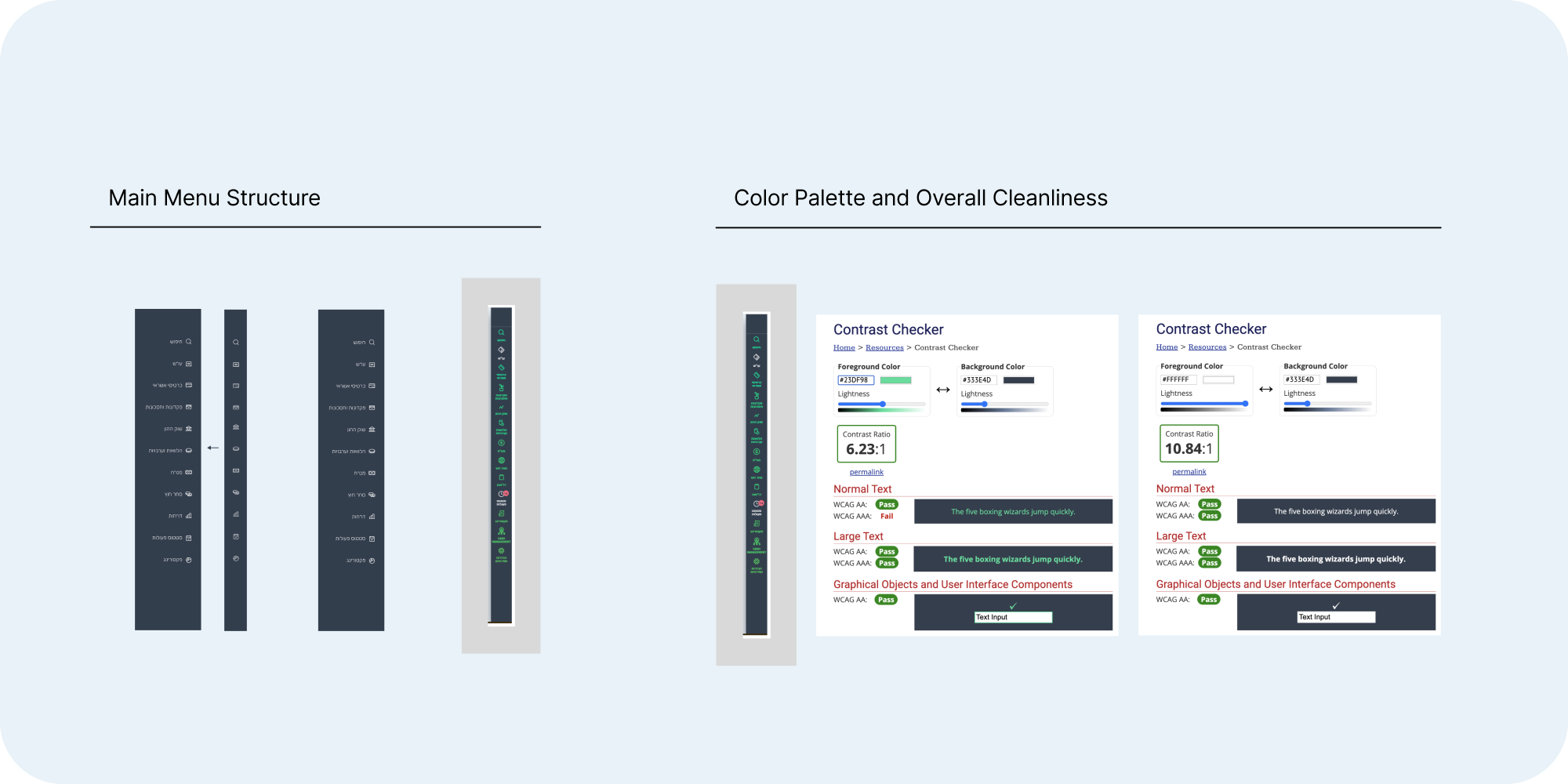
Dynamic and Scalable
Using design conventions for intuitive design

In-bar scroll feature to ensure future scale
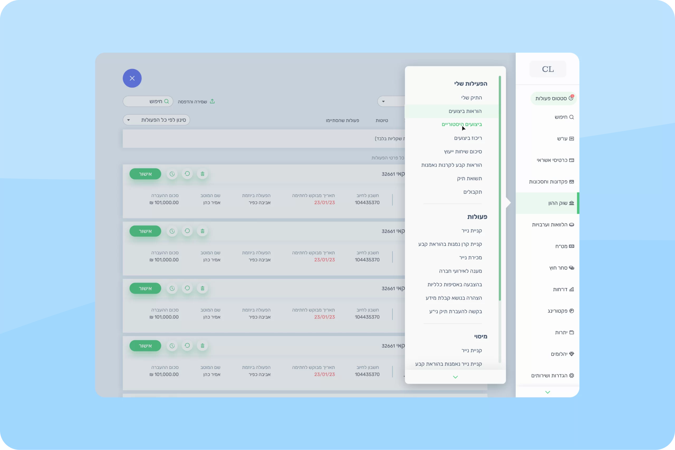
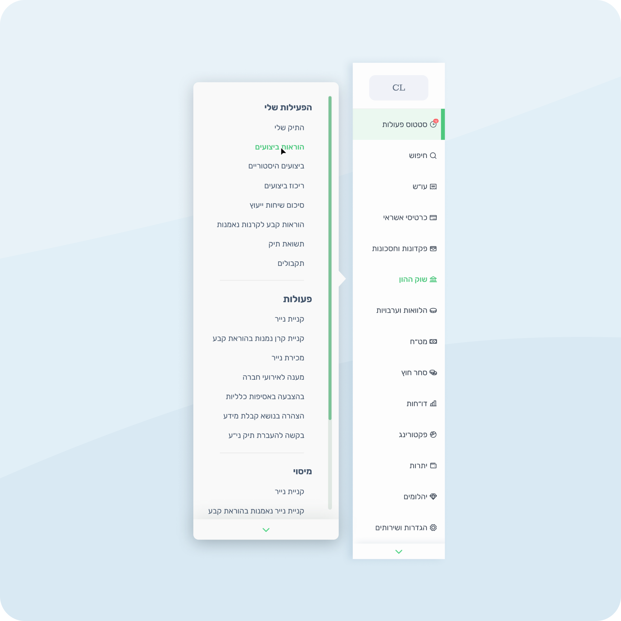
Transformation in Action
highlights the shift from a cluttered navigation bar to a clean, intuitive design, improving usability and creating a seamless user experience
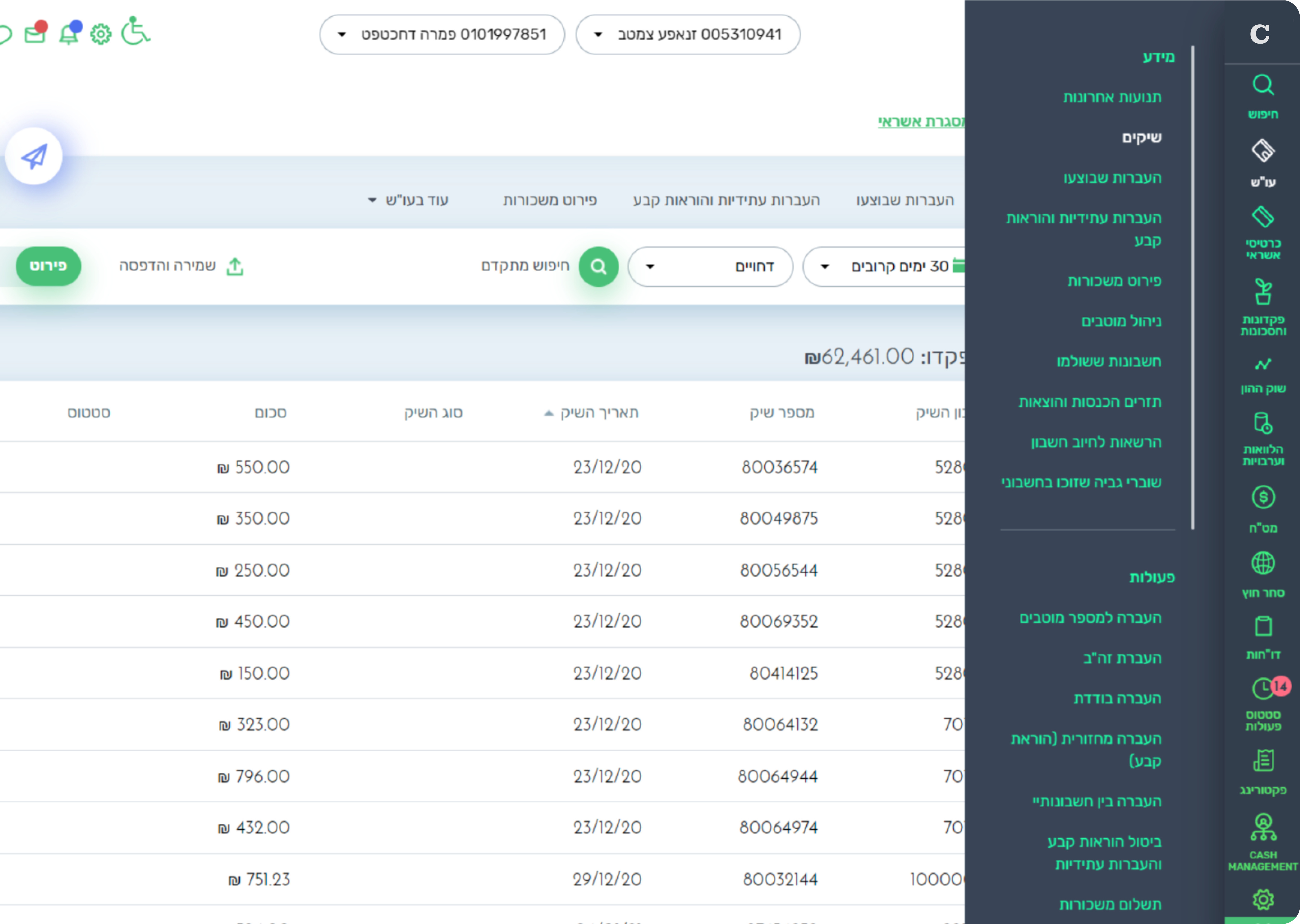
Before – Initial State

After – Optimized State
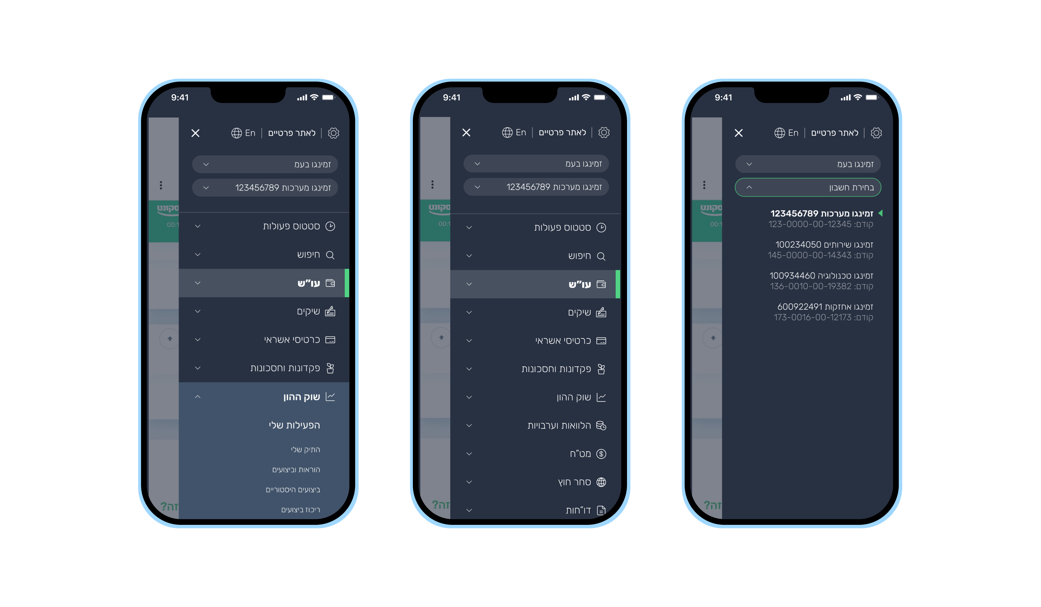
Mobile View Adaptation
See how the designs translate seamlessly to mobile screens

First Project Sparks Lasting Partnership
This was our first project with the customer, and it was well-received, demonstrating clear improvements in user experience. As a result, the customer chose to expand their collaboration with us, leading to a long and successful partnership
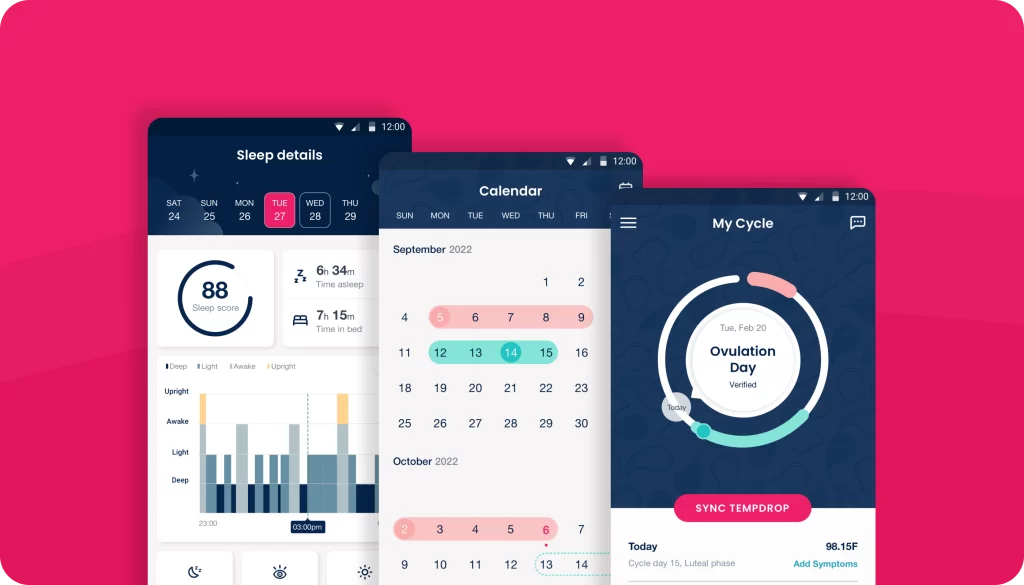
Explore More Projects
Check out other projects that reflect my design work and impact
Digitized User Experience

Innovative Educational Platform