Digitized
User Experience
Enhanced user experience by digitizing bank account user management and registration
Brief Introduction
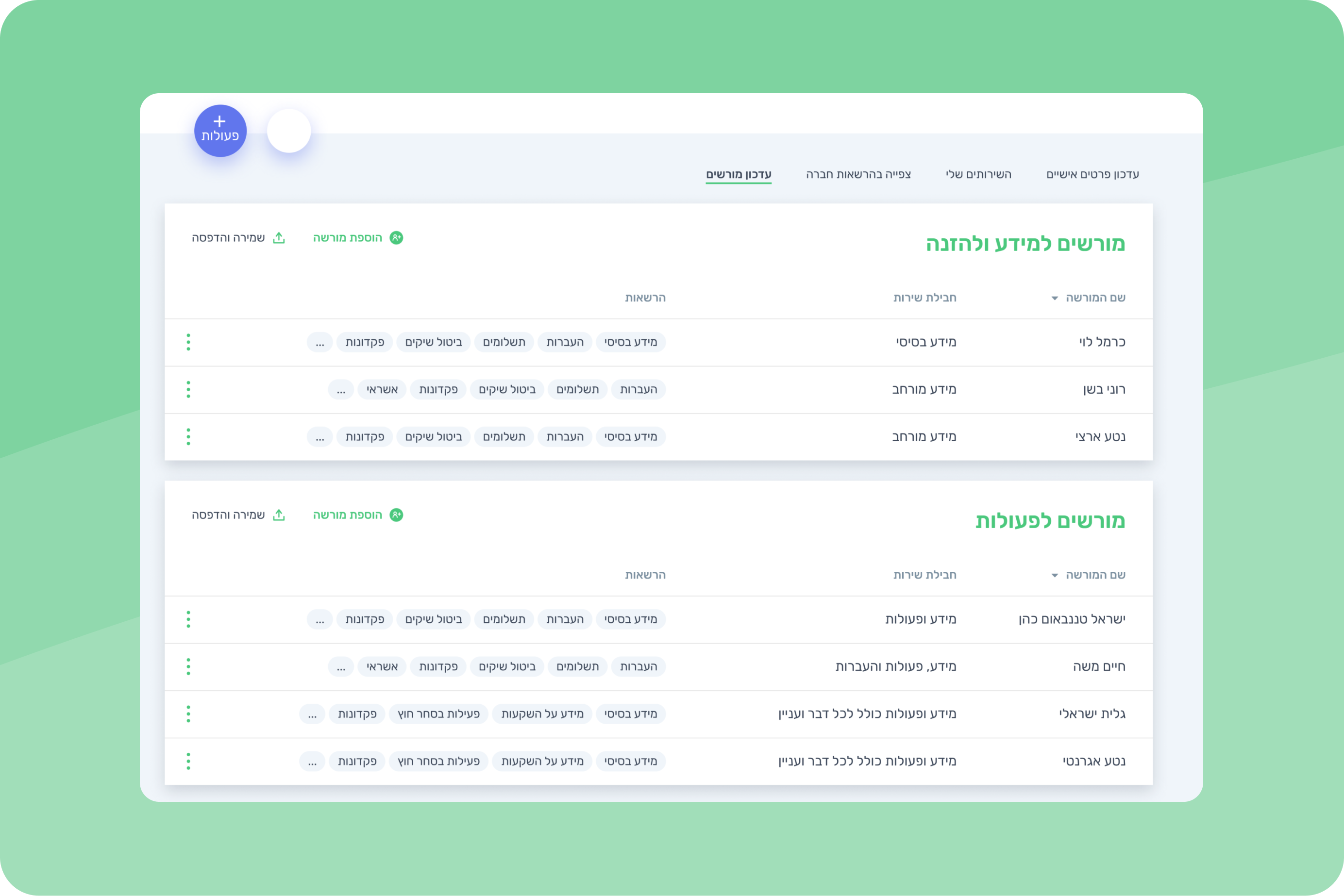
The bank aimed to upgrade its systems to boost efficiency and user satisfaction for business bank account owners through digitization, enabling them to save time and streamline their tasks
Focus
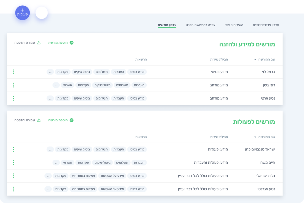
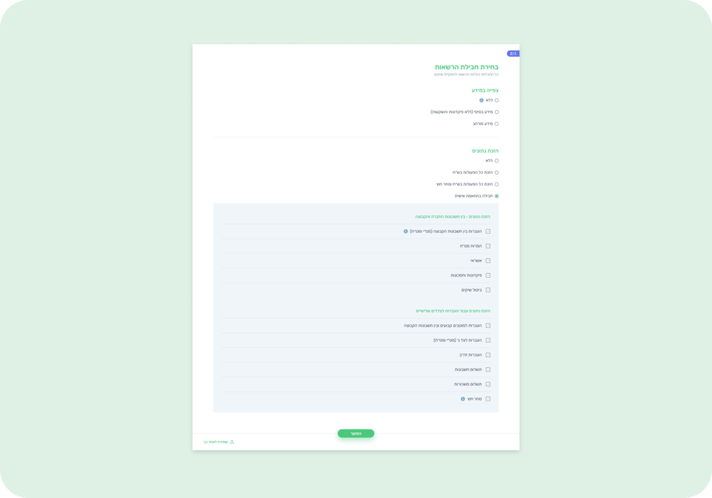
Streamlined the process of adding new stakeholders to accounts and managing their permissions
Team
Design Team:
Me (Lead Designer) + VP Product (Mentor)
Who I worked with:
Project Manager TL + Team, Copywriter & Dev team
Tools
Figma


Challenge
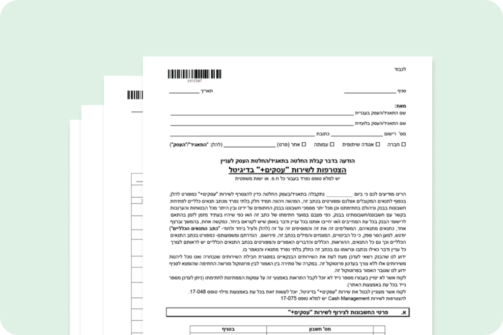
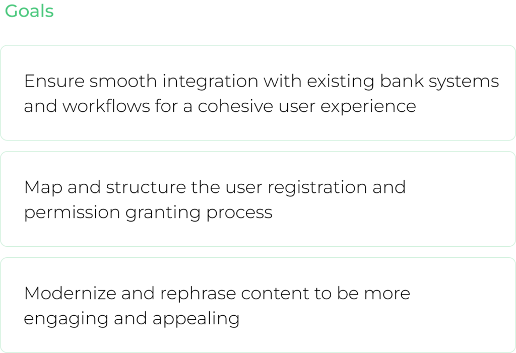
Transforming complex and outdated registration forms with restrictive capabilities into a simple and intuitive digital experience

Pain points
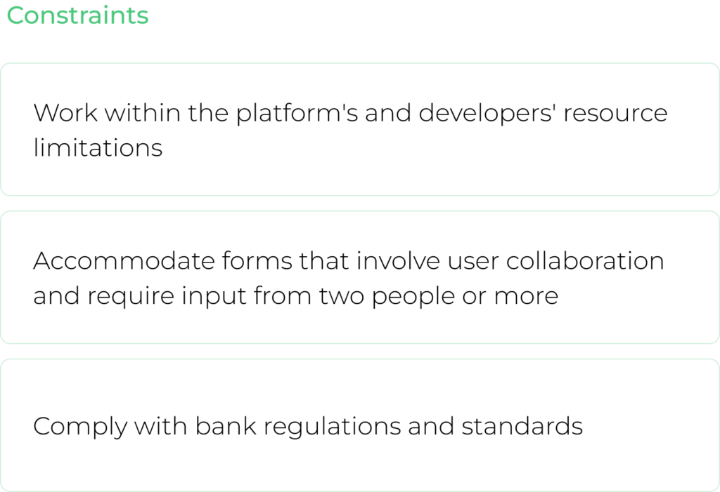
We analyzed data on user preferences and feedback from business bank account owners, identifying the following key pain points
Physical Presence Required
Registering a new user or modifying permissions necessitates a physical visit to the bank, creating inconvenience for users
Impact of Unclear Language
The use of unclear and traditional language negatively impacts the user experience, making interactions less intuitive
Inefficient and Outdated Processes
The existing process is ineffective and outdated, resulting in wasted time and energy for both users and bank staff
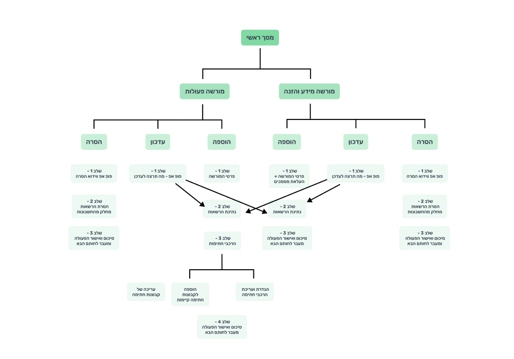
Mapping User Journey
To effectively meet our objectives, we began by mapping out the user journey and analyzing the structure of user permissions and registration forms

Key design features
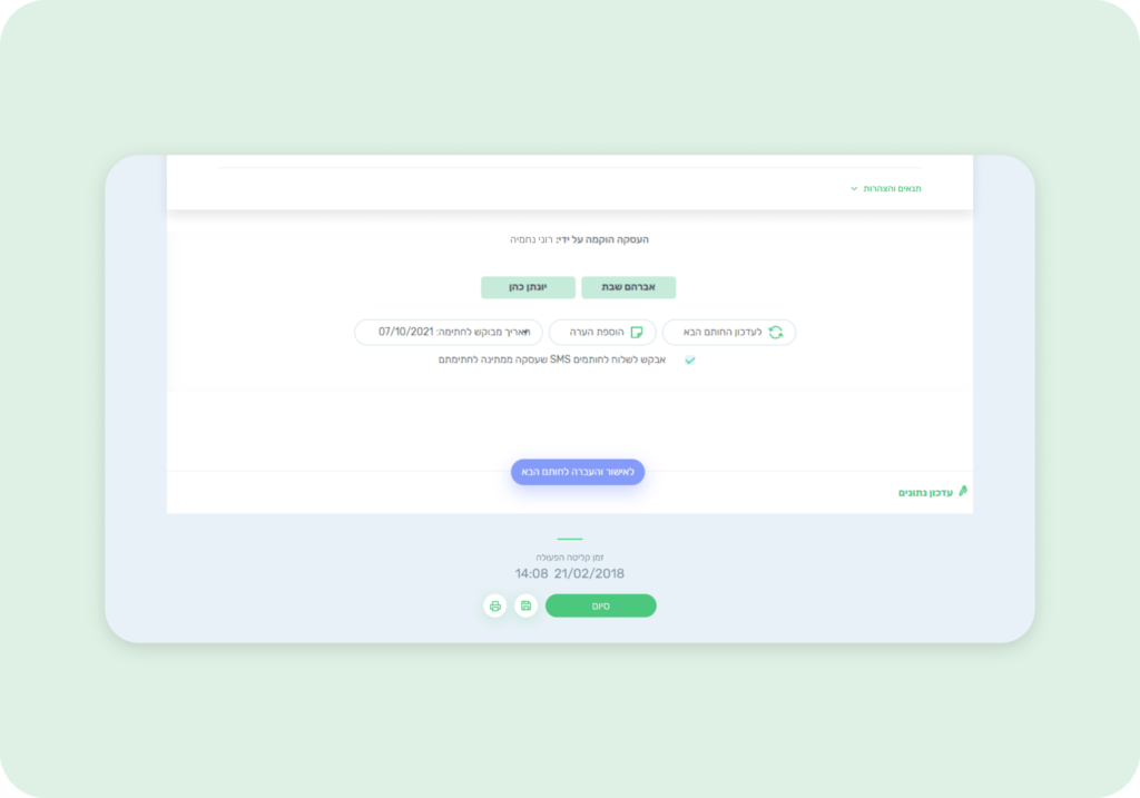
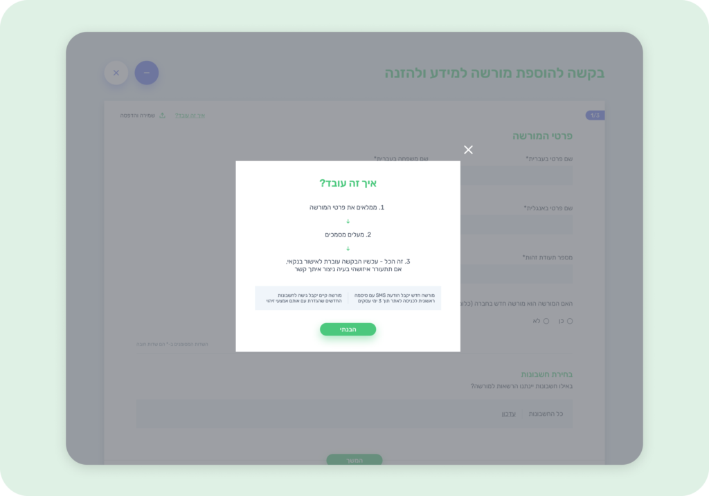
Combining Pain Points, User Journey and accurate pixel-perfect techniques
Prototype
Combining research, insights, and accurate pixel-perfect techniques
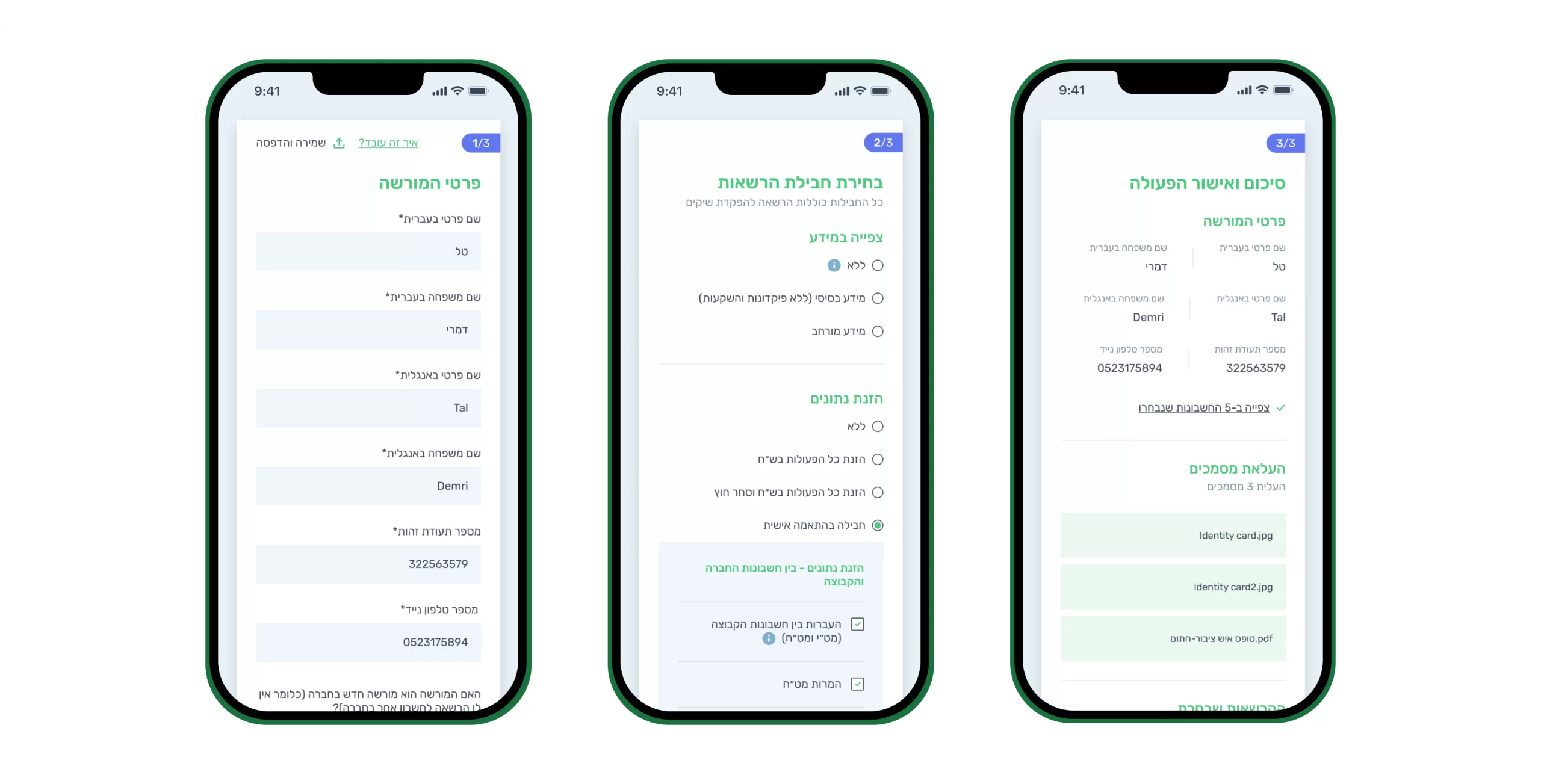
Mobile View Adaptation
See how the designs translate seamlessly to mobile screens

